Weekly Update #7 - UI

My career is UI design so I put some of that to work this week! I created some early versions of the controls and settings UI. I’m a huge fan of simple user interfaces that are easy to use and understand. Stuff like settings and controls shouldn’t be difficult to change, they’re there to help the player play the actual game.
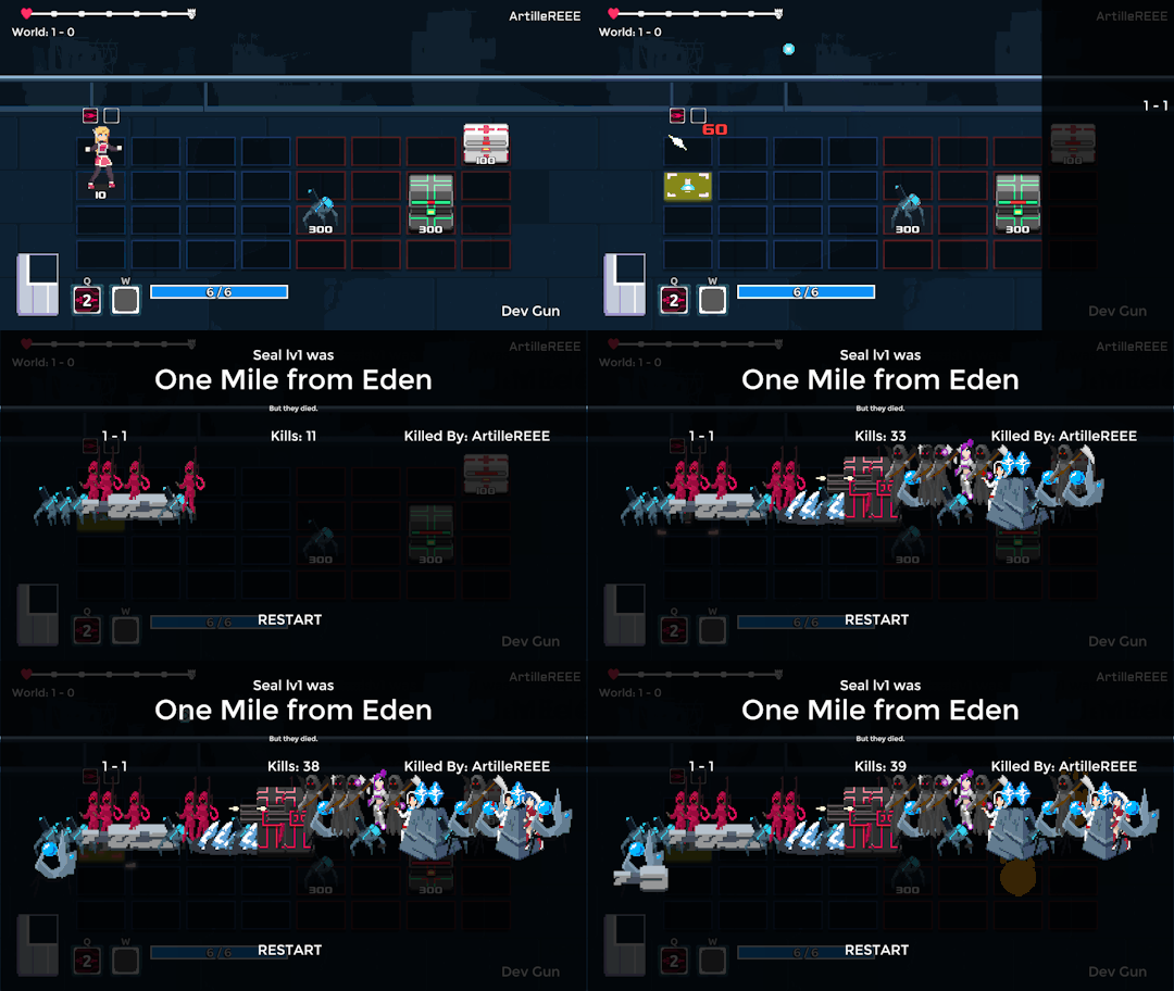
I started working on a little Game Over screen that shows what world you made it to, how many kills you got (along with all the enemies you killed), and who you were killed by. At the top it shows name and level along with a vague message about how far you made it. None of this stuff is even close to final though.

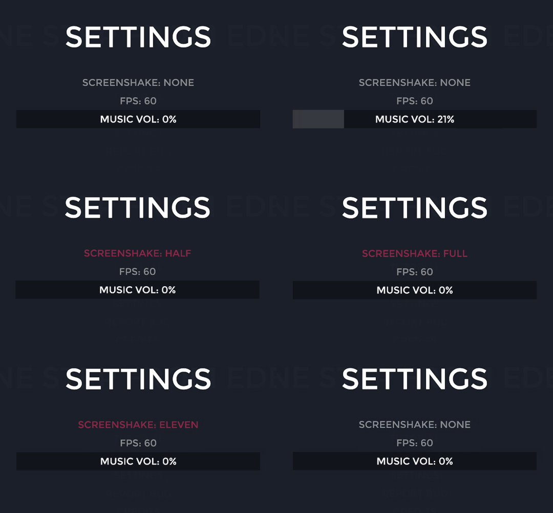
Added some of the basics for a settings screen and made sure they were completely functional. The music volume is a simple minimalist slider. The fps cycles through some typical fps amounts. The screenshake button cycles through the different levels, and gives a little preview of how much it can shake at that level. It goes all the way to 11.

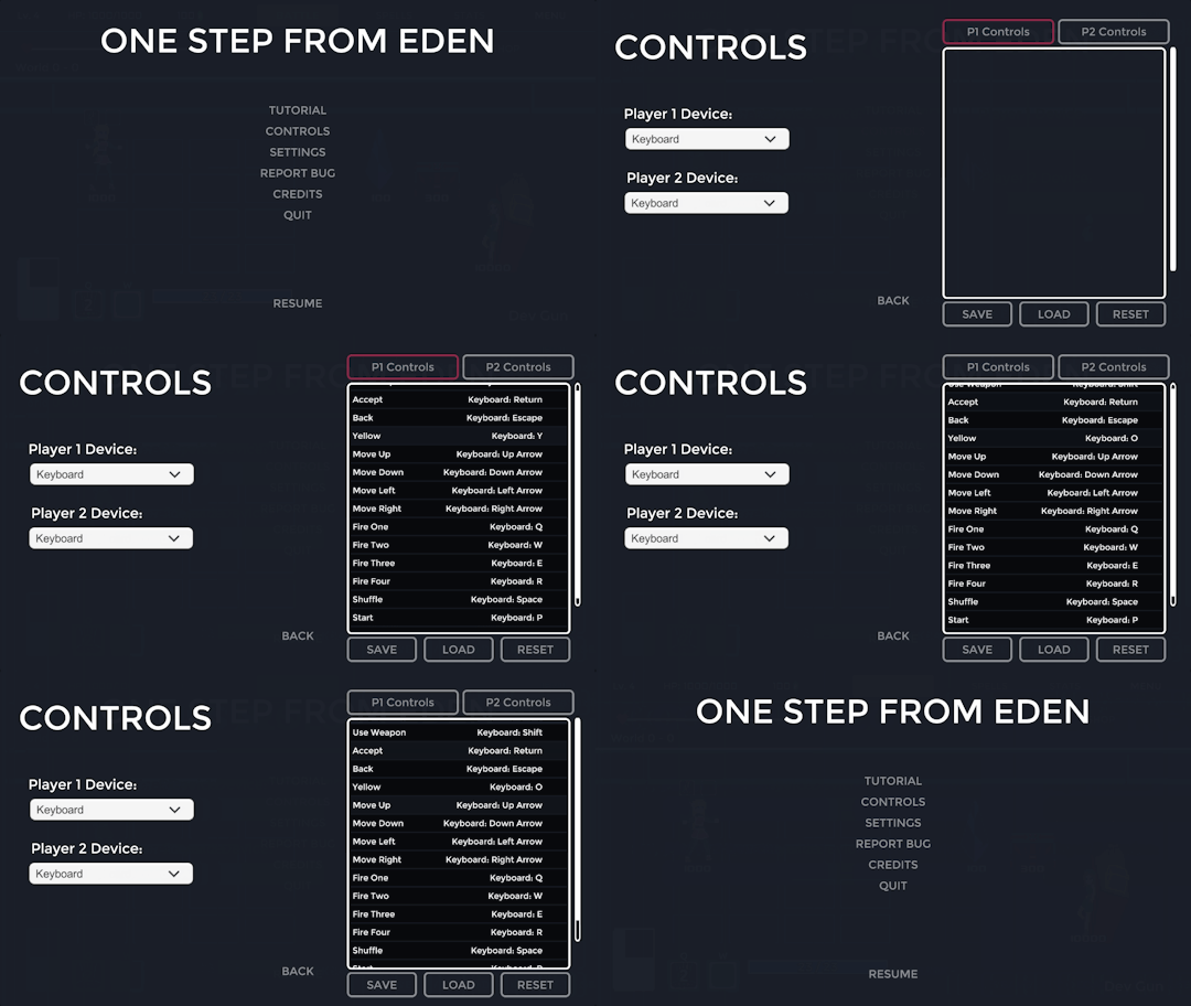
Still an early version of the controls screen. It gives players the option to save and load their layouts as well as reset to default. Devices can be set in the dropdowns to the left. On the top are where you can choose which players controls to edit. May add keyboard icons instead of just using text in the future.
Thanks for reading.
One Step From Eden Demo
Megaman Battle Network inspired Roguelike
| Status | Released |
| Author | EdenDev |
| Genre | Action, Adventure, Strategy |
| Tags | Cute, Deck Building, Female Protagonist, Pixel Art, Roguelike, Roguelite, Singleplayer |
| Languages | English |
| Accessibility | Configurable controls |
More posts
- Character Skins - Design Concepts!Nov 01, 2019
- Demo v166 + PAX East UpdateApr 11, 2019
- Demo Patch - v160 +30,000 downloads!Feb 22, 2019
- v155 - Ricochet mechanics updateJan 29, 2019
- New Character - Reva v150!Jan 23, 2019
- Weekly Update #50 - MAGFest RetroJan 11, 2019
- One Step From Eden Kickstarter is Live! + v140Jan 03, 2019
- One Step From Eden Demo v130Dec 24, 2018
- New design and animations for Selicy!Dec 18, 2018
- Weekly Update #48 - TrinityDec 07, 2018

Leave a comment
Log in with itch.io to leave a comment.